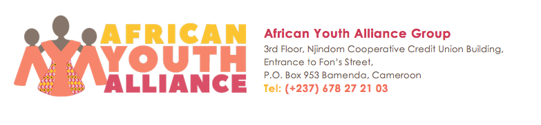
Logo Design for a women's charity
I was asked to design a logo for an amazing organisation based in rural Cameroon. They are trying to establish more funding to work their magic with women and girls. They set up training, discussions on health and help women to alleviate poverty facebook.com/africanyouthalliancegroup
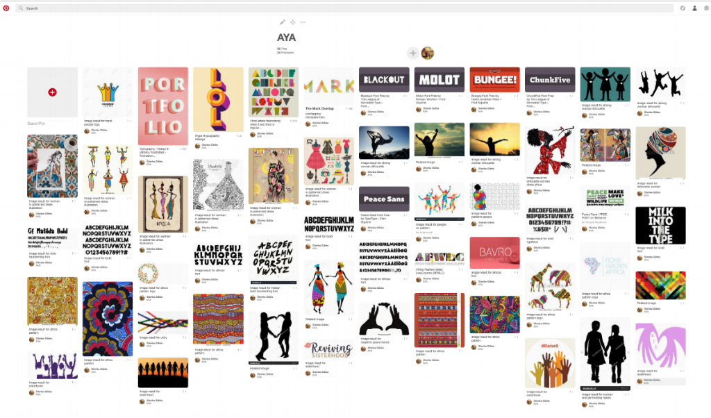
Inspiration and ideas
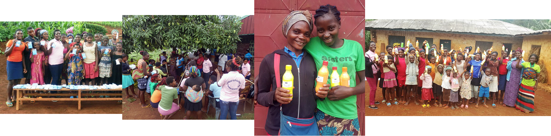
They sent through loads of photos of their work in Cameroon and I spoke with their director, Rosaline. We discussed their needs, their aims, their work and how I could help them. After completing a written client survey, I understood that their brand should be: empowering, fun, bold, brave, supportive, focused on women and girls and colourful.
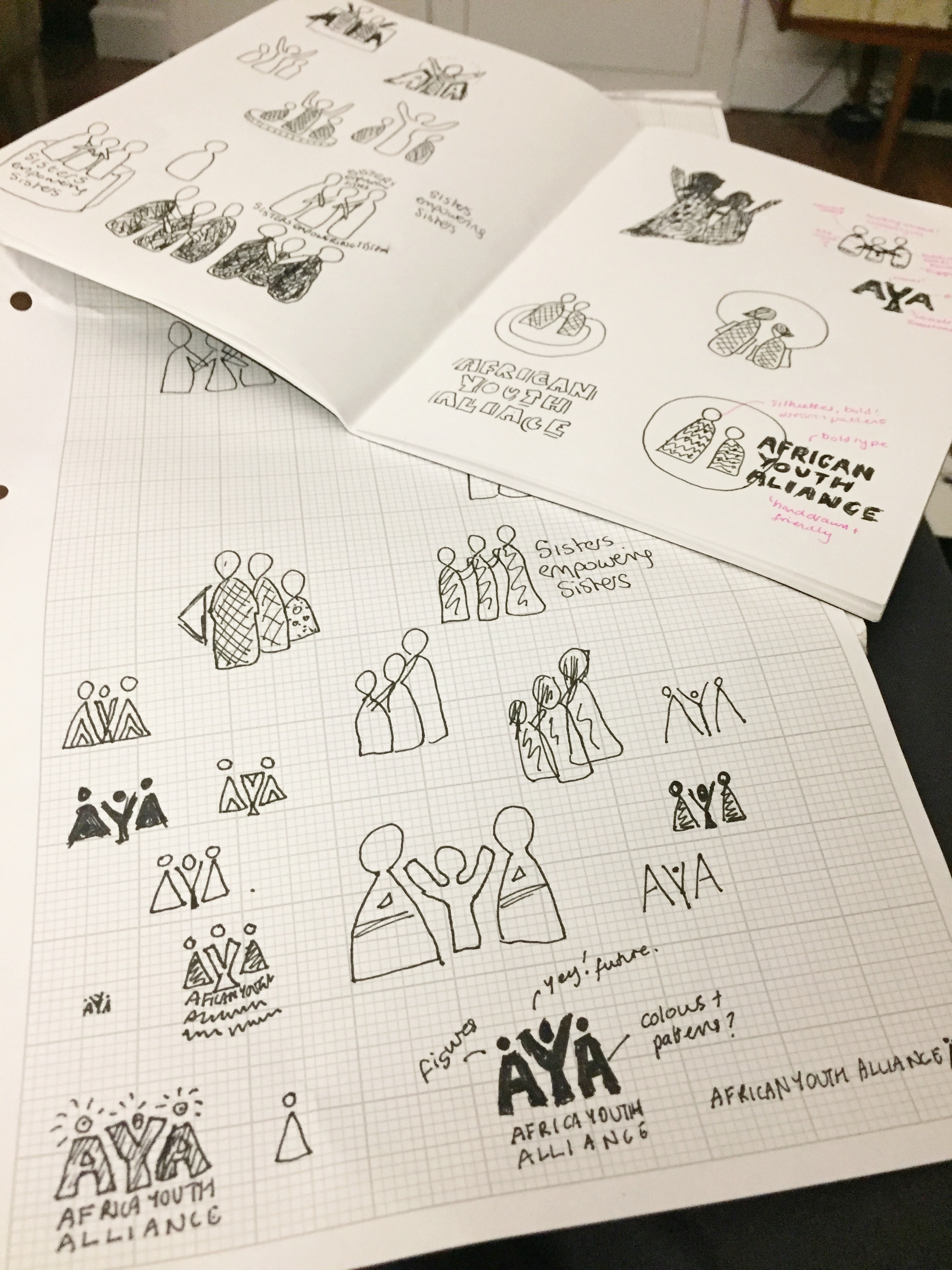
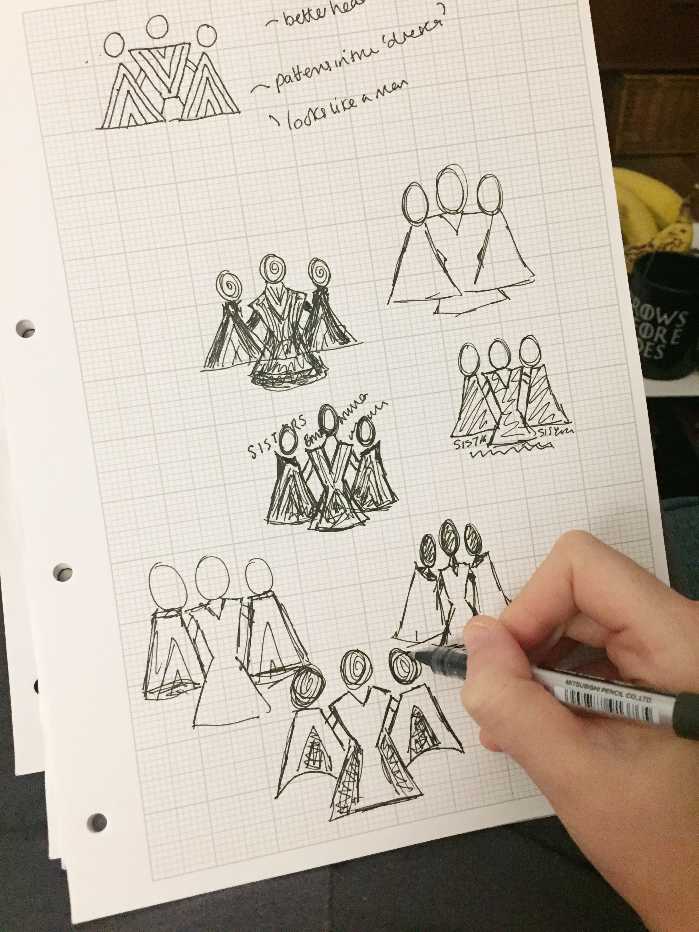
Sketches and Treatments
I then went on to produce some ideas by hand. Their tagline of "Sister's Empowering Sisters" was very emotive. Simplifying the images of women and also thinking about the AYA, I set about creating the letters and women motif.
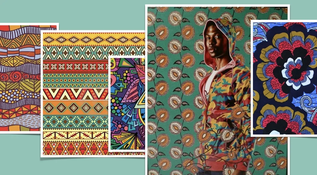
Cameroon has some incredible colour associations - from nature, art and textiles. I drew inspiration from the landscape and research on textiles in the area.
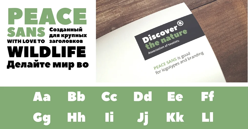
The font I thought was fitting was 'Peace Sans' - which says it all in the name! A bold and fun font sending an empowering message. This is also a font they can use on the website and other placements as a heading font.
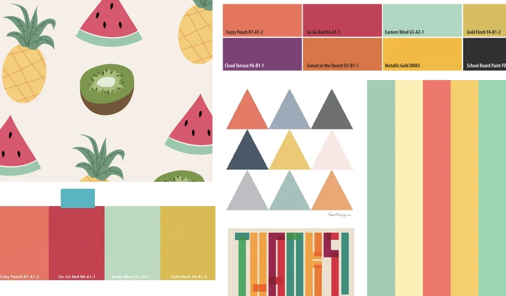
In terms of colour palettes, the fun and excitement needed to come through, I was thinking of watermelons and fruit. The red matches the landscape of red hills in the areas that they work in.
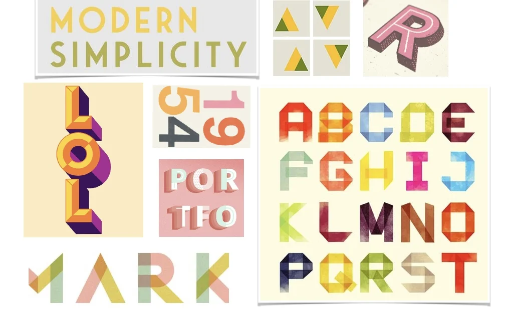
The text needed some nice treatment; colours, layout etc. I chose to place the two letters. As well as the AYA figures being interconnected, in the word only version the N and Y are connected to show the human bonds that the charity help to create.
Final Logos
“We are just overwhelmed and filled with gratitude. A HUGE THANK YOU for everything! We so much love the idea of AYA becoming subtle women in the logo. The Y in the middle with a woman and her hands supporting other women, both as on the logo is brilliant. You have really grasped what our work is all about, strong, bold, brave women empowering women, sisters empowering sisters. And the logo just summarises all that! ”