UI Redesign for freesat TV service
I worked with Edge UX to redesign the UI of the Freesat service. Freesat is a freeview and satellite TV service which has millions of users in the UK. For this particular project, there was no movement for UX (or very little!) due to STB constraints, so we had to work with just imagery, colours, fonts and even take out some elements.
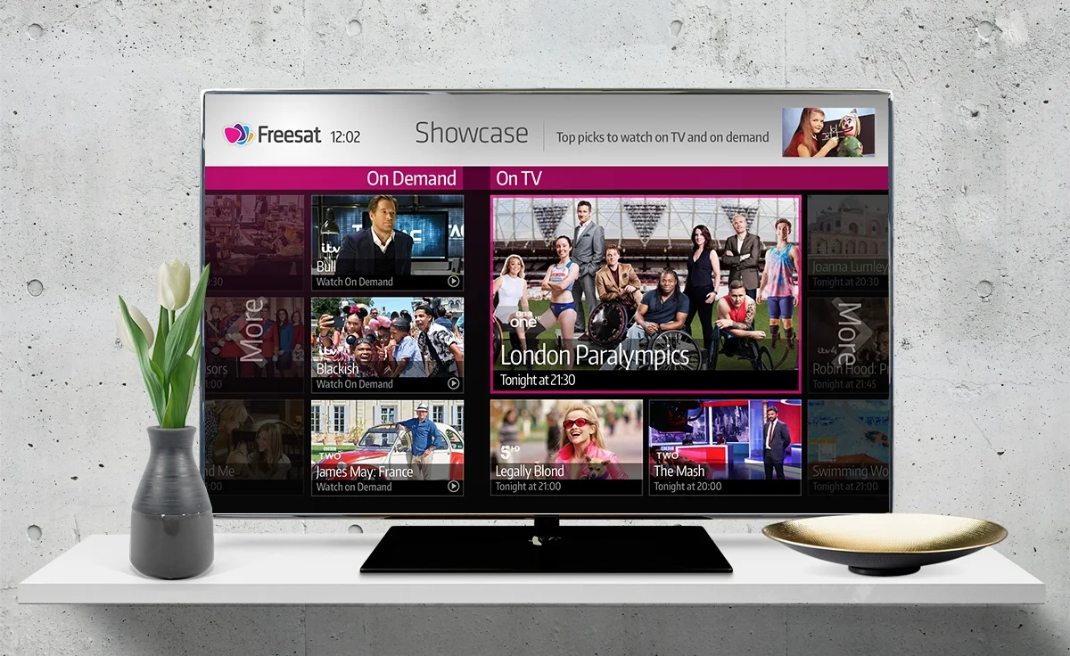
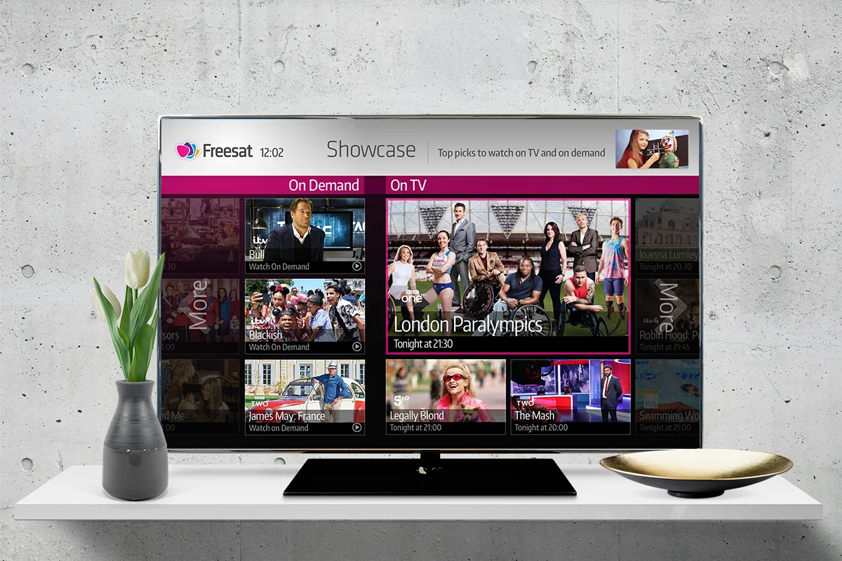
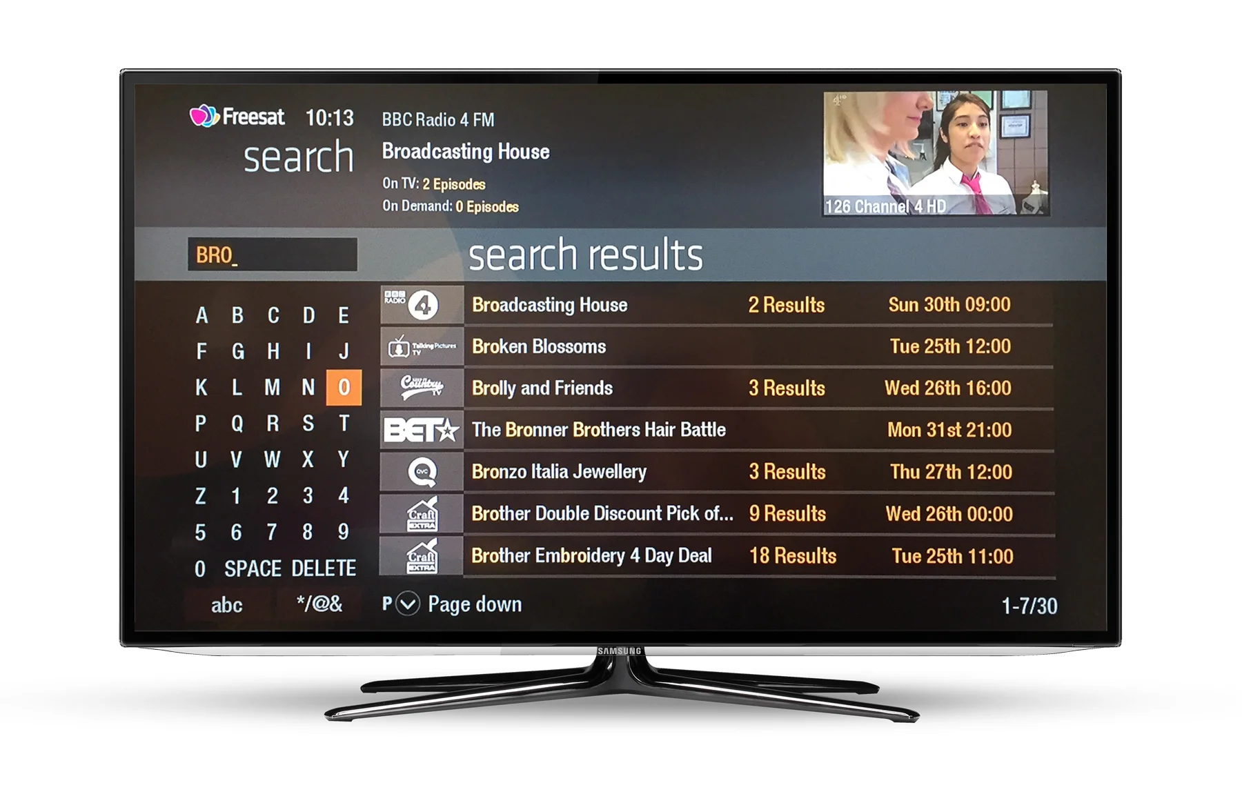
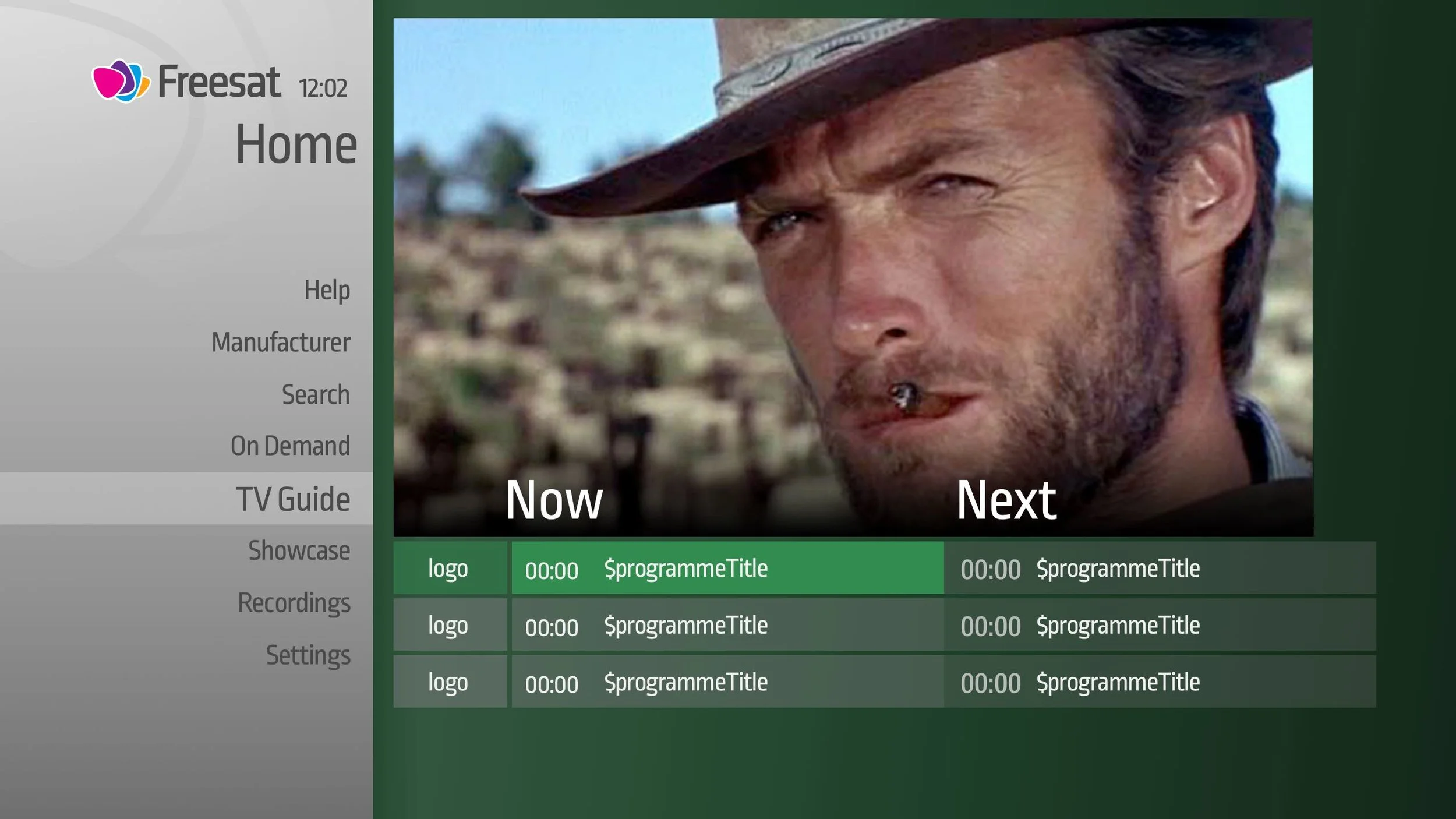
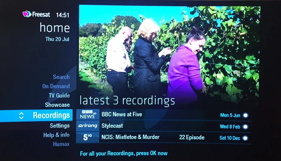
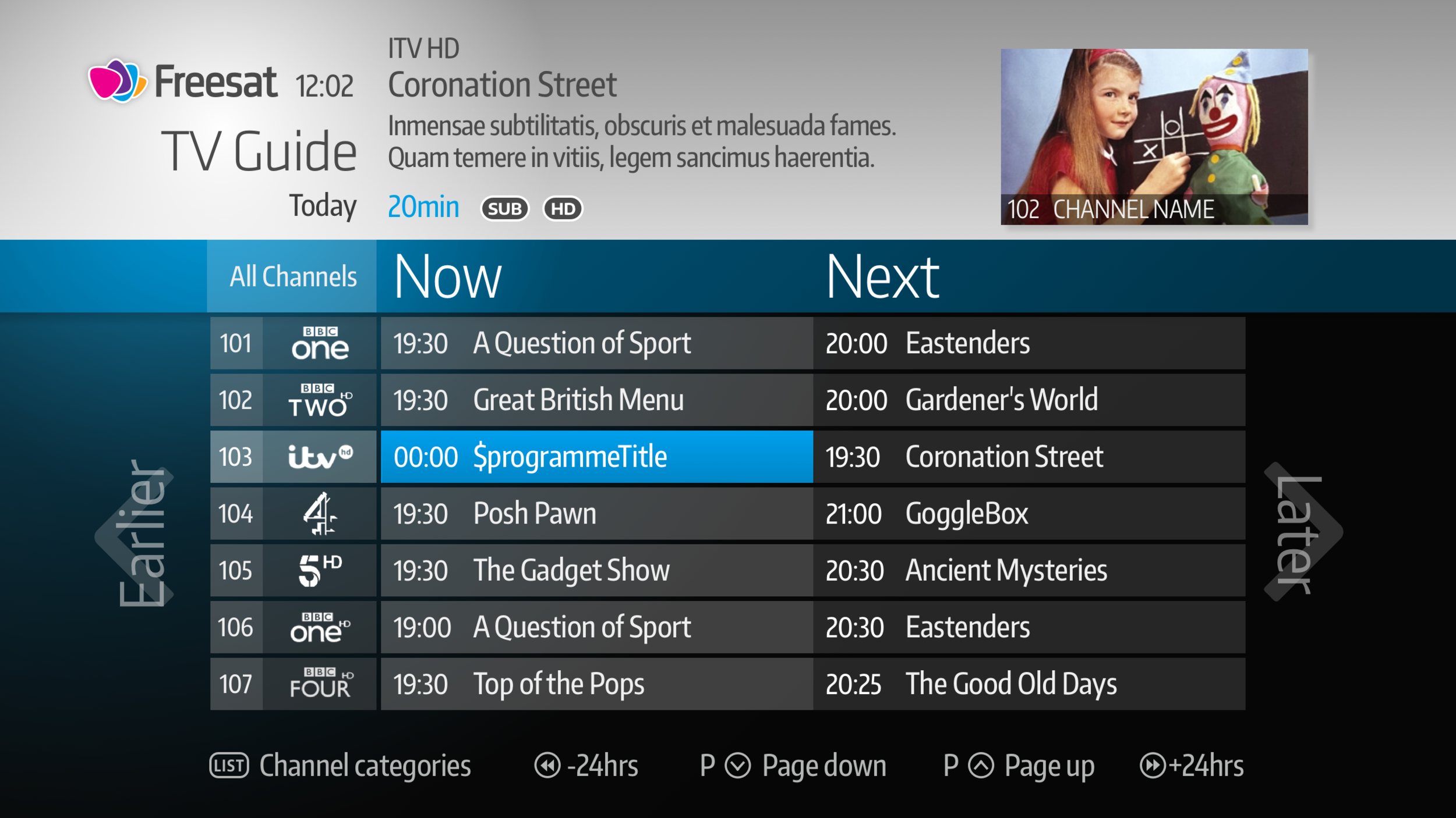
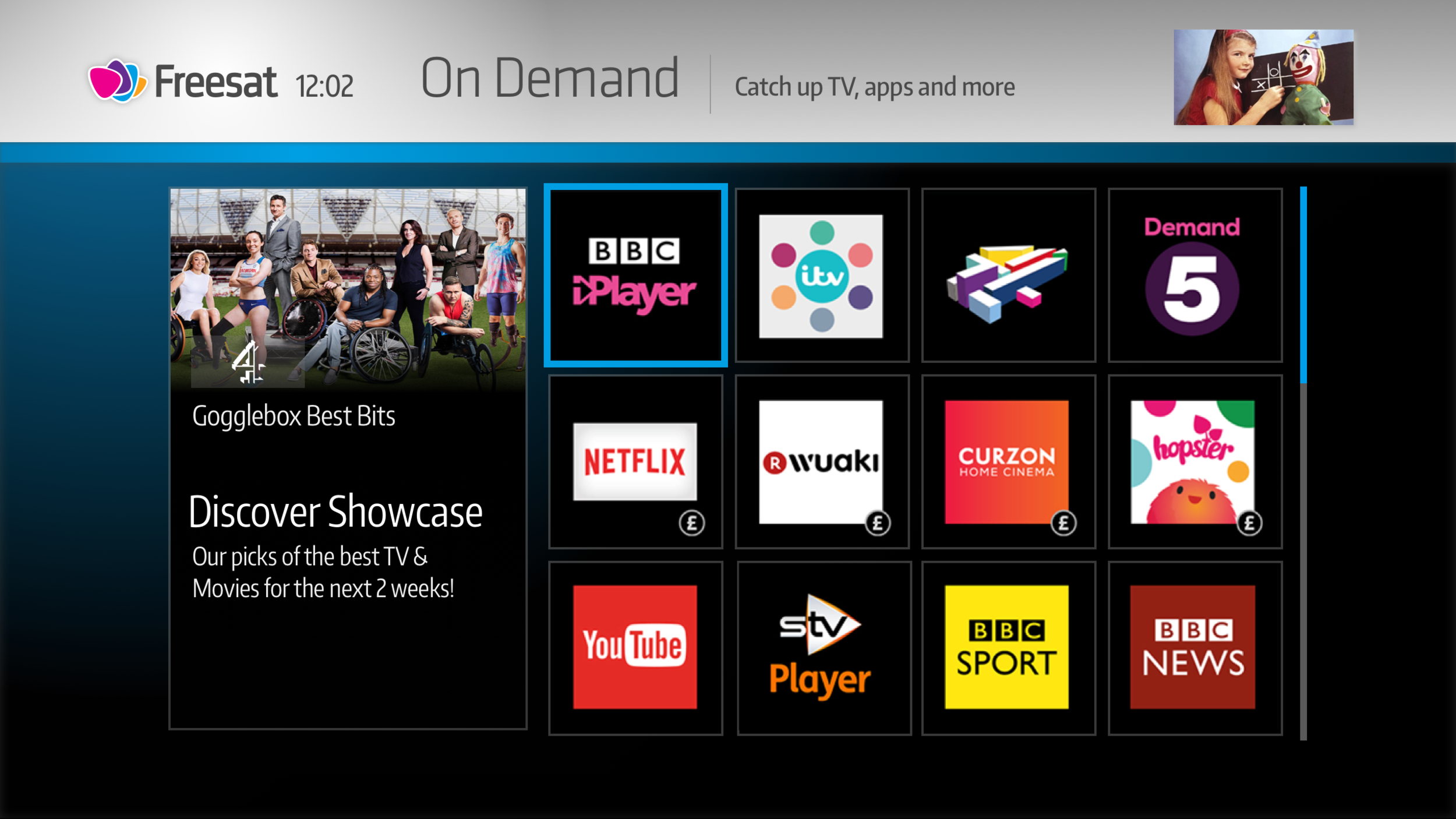
Previous design
The Freesat service has not been redesigned for a few years and customer feedback and brand research led to planning the improvements. Pain points included: the colours are not on-brand, 'plectrum' motif in the background (from the logo) is distracting and the screen is too busy. Current design outlined below:
First Drafts
Myself and Mat (designer) worked on building Sketch pages and creating first drafts. At this point, we are not sure what's possible to change, as the legacy build and ownership is controlled by the manufacturer. But we decide on a 'best case scenario' working method. Here is the current version (which needed to be rebuilt in Sketch) and further exploration.
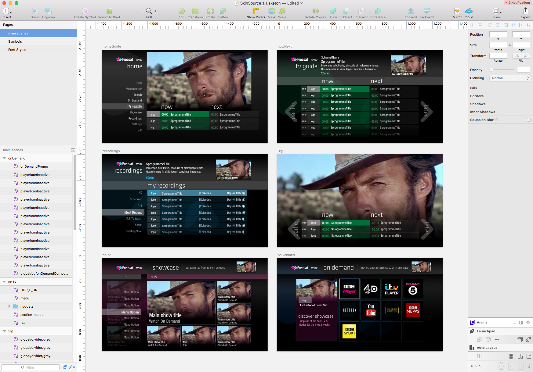
Light and Dark Versions
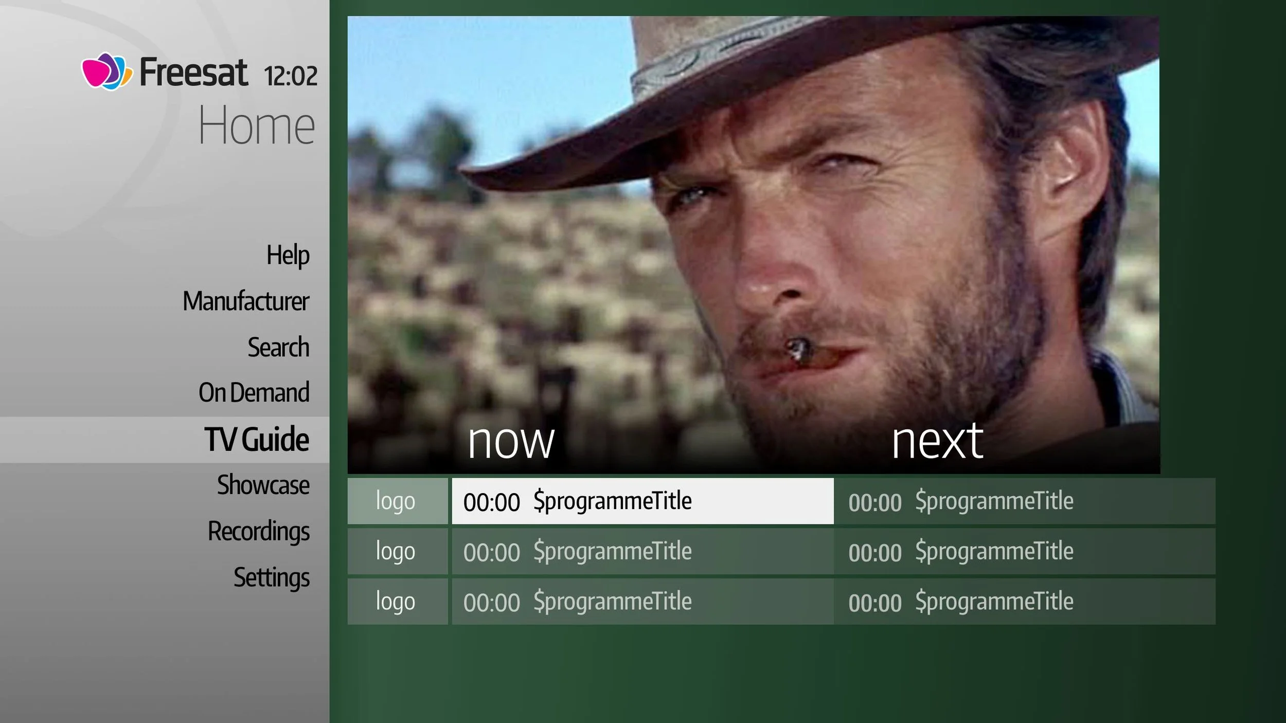
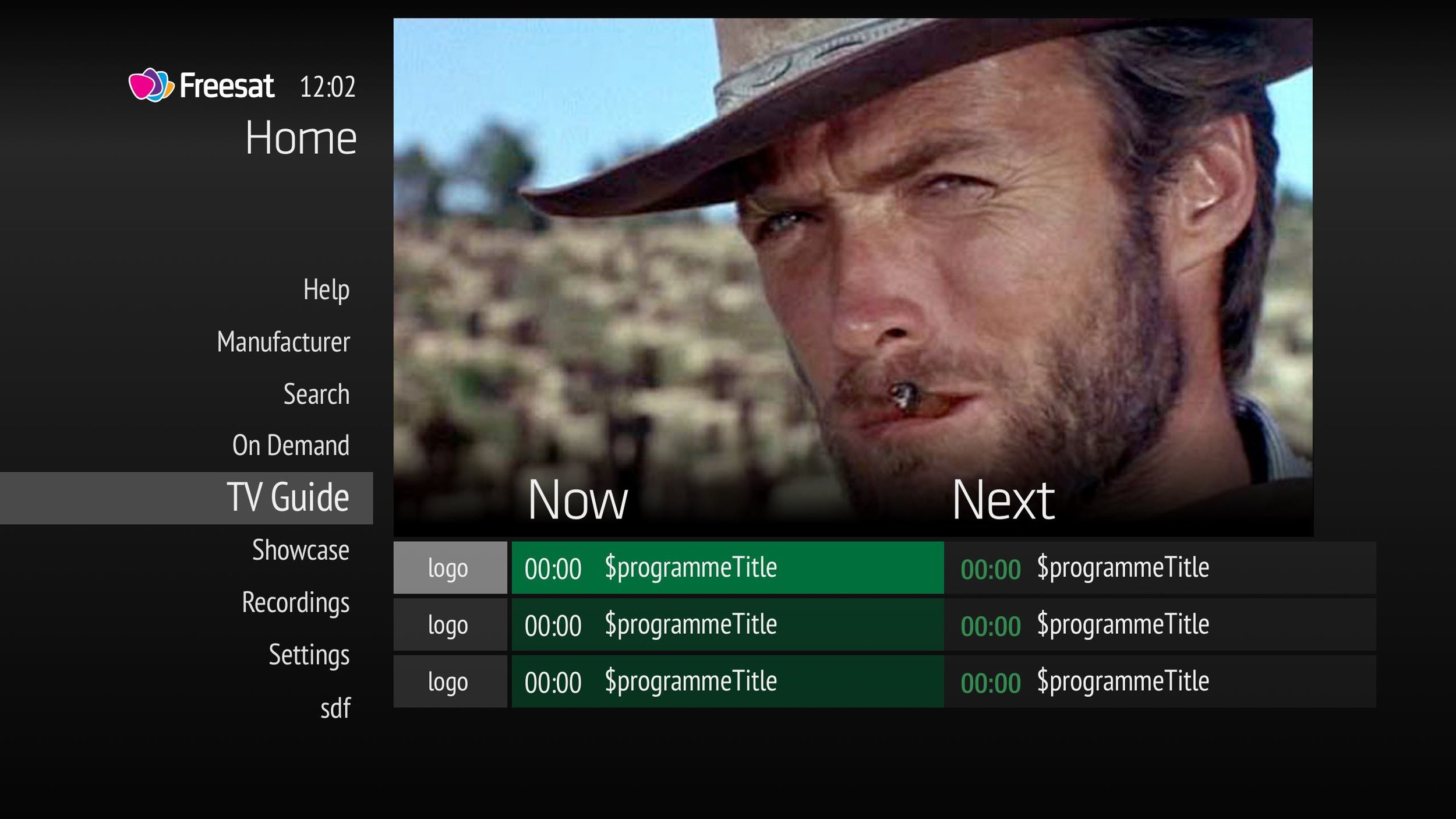
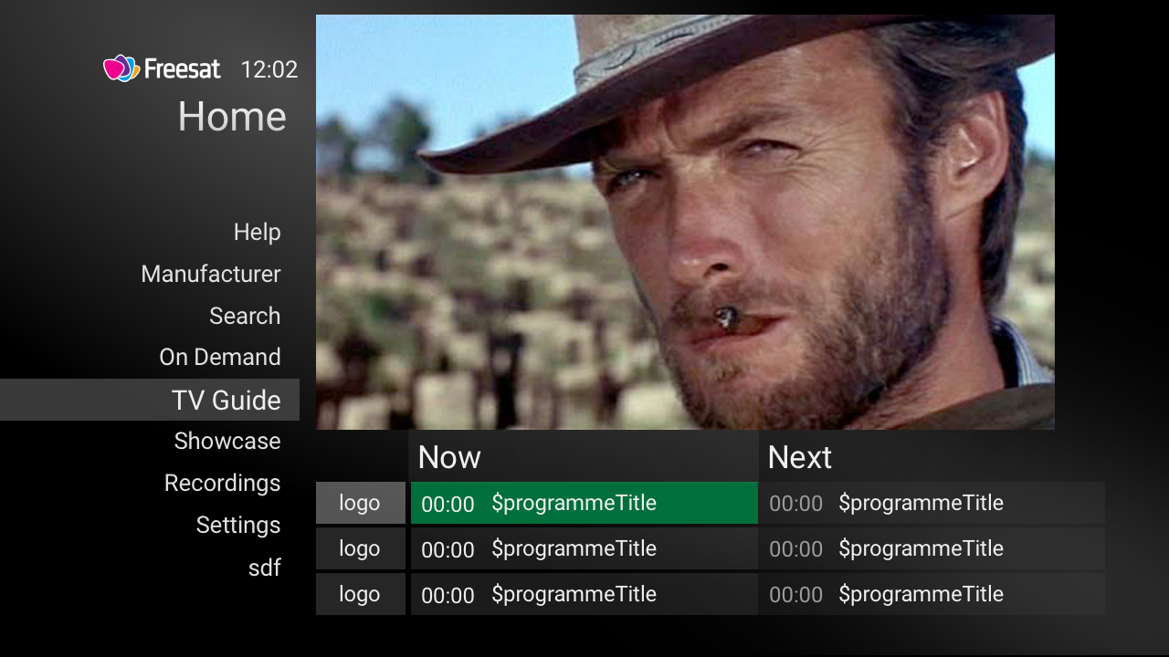
We like these... with changes
After reviewing with the product team and further user testing via a quick online survey to existing customers, the blue tested well and the design changes were well received. They liked the grey header and a simpler design and font. So we had a starting point for full development. This was chosen as the template to start from...
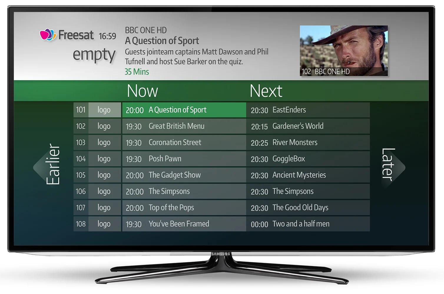
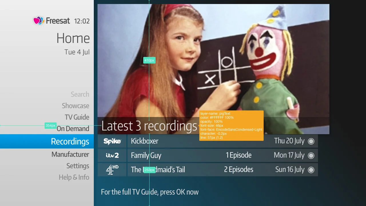
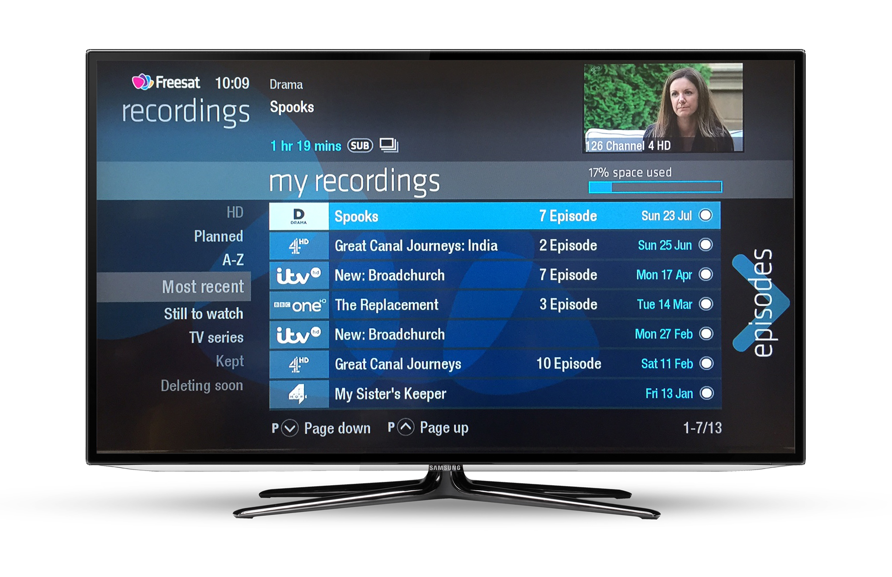
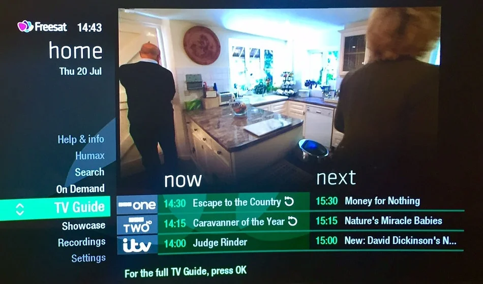
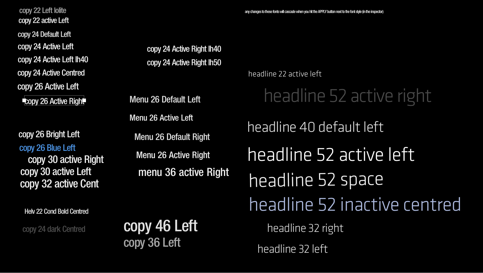
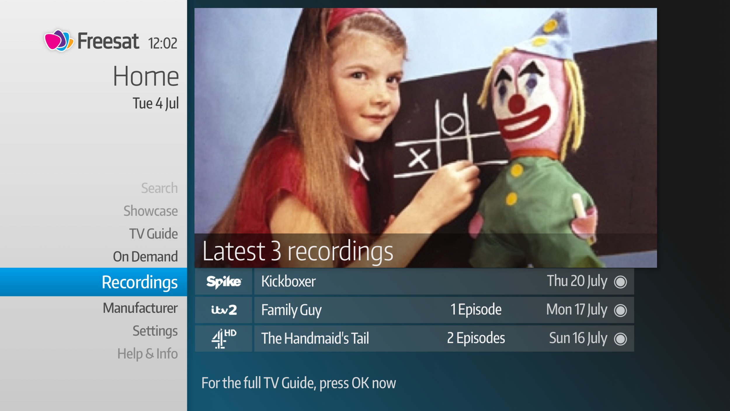
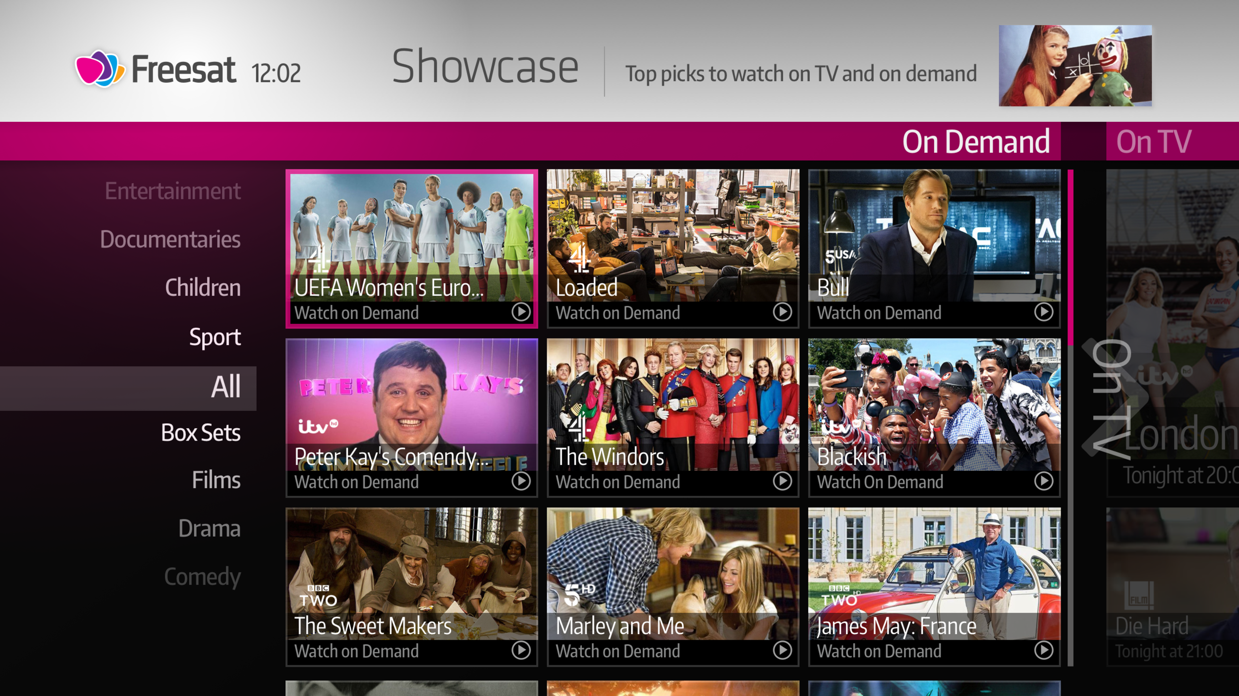
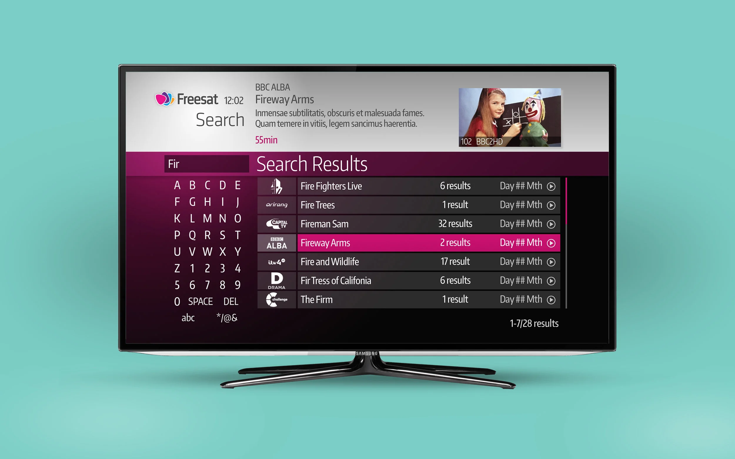
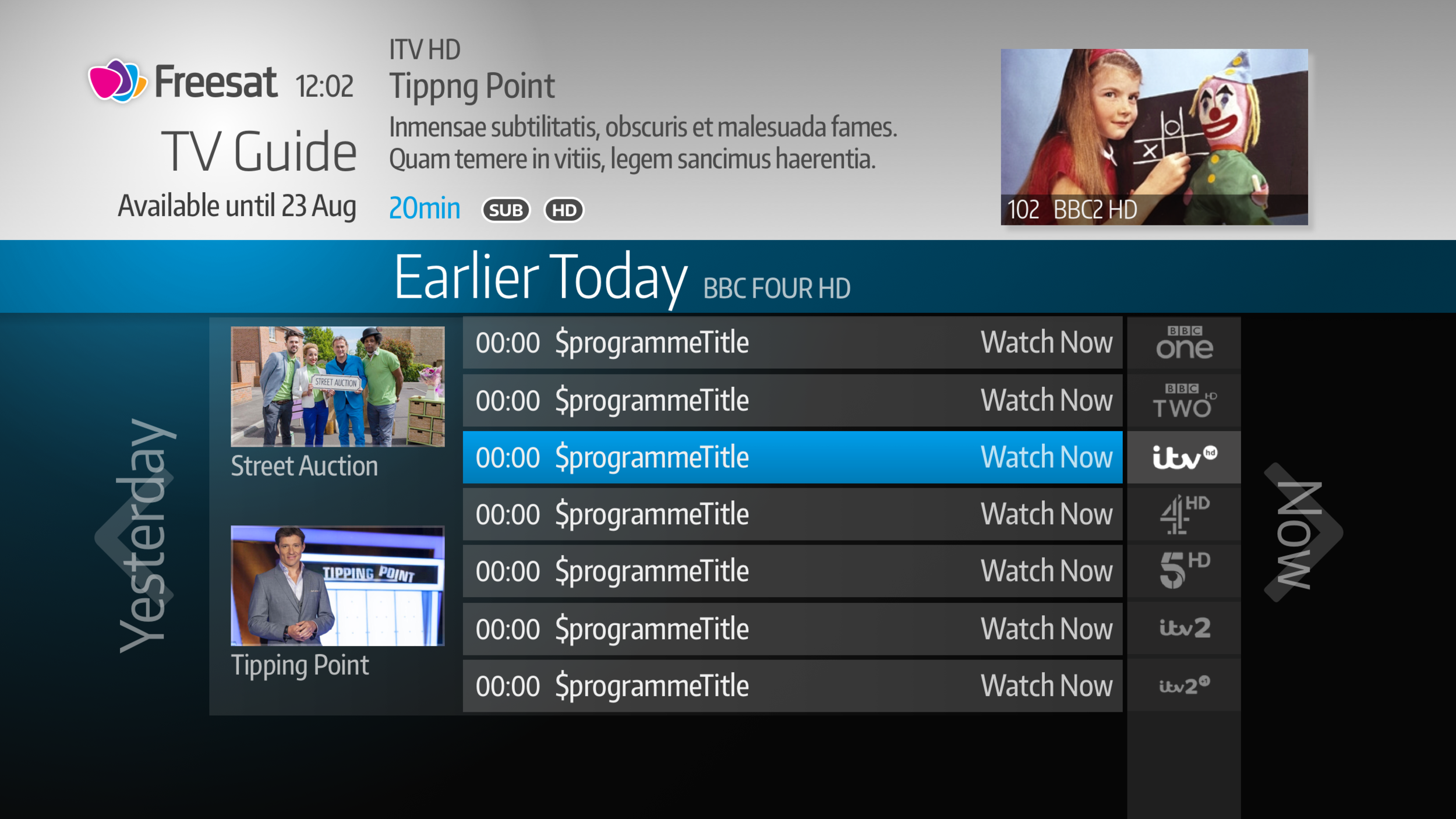
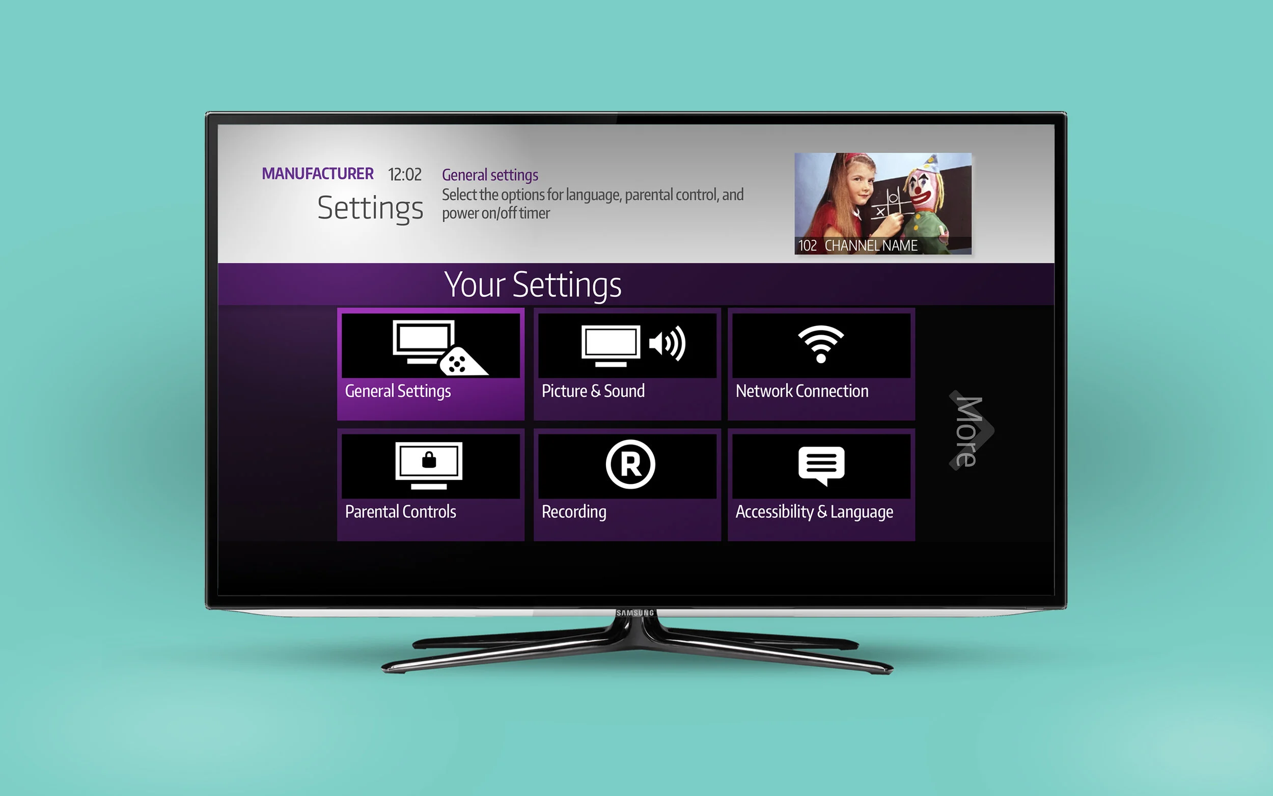
accurate designs
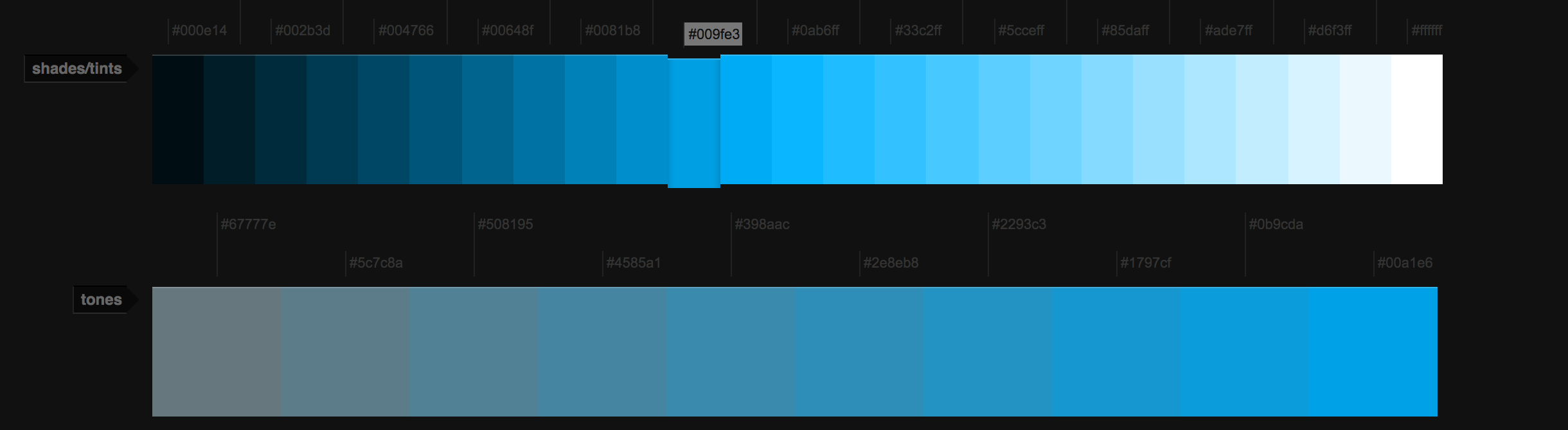
Then working as lead designer, I polished the designs with real content, graphics, colours based on feedback and using the new font, Encode Sans. This included creating backgrounds (which were then tested on device), a definitive colour palette, legible and accurate font sizes, consistent menu options etc so a developer could easily read the changes.
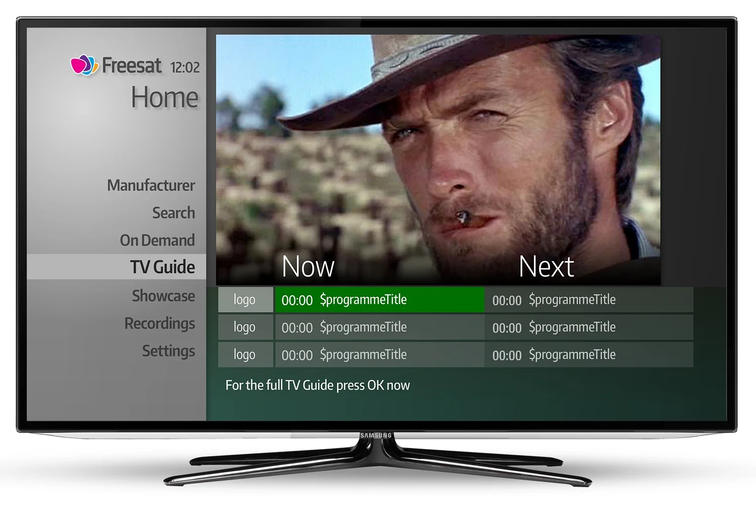
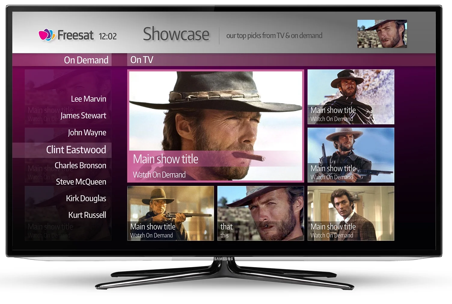
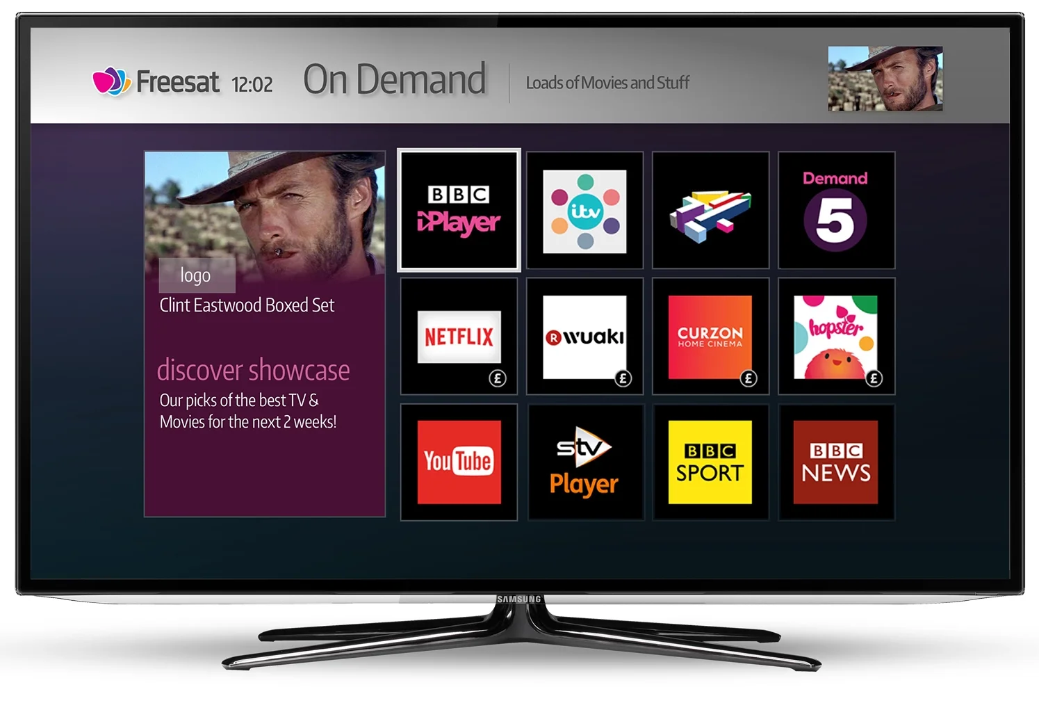
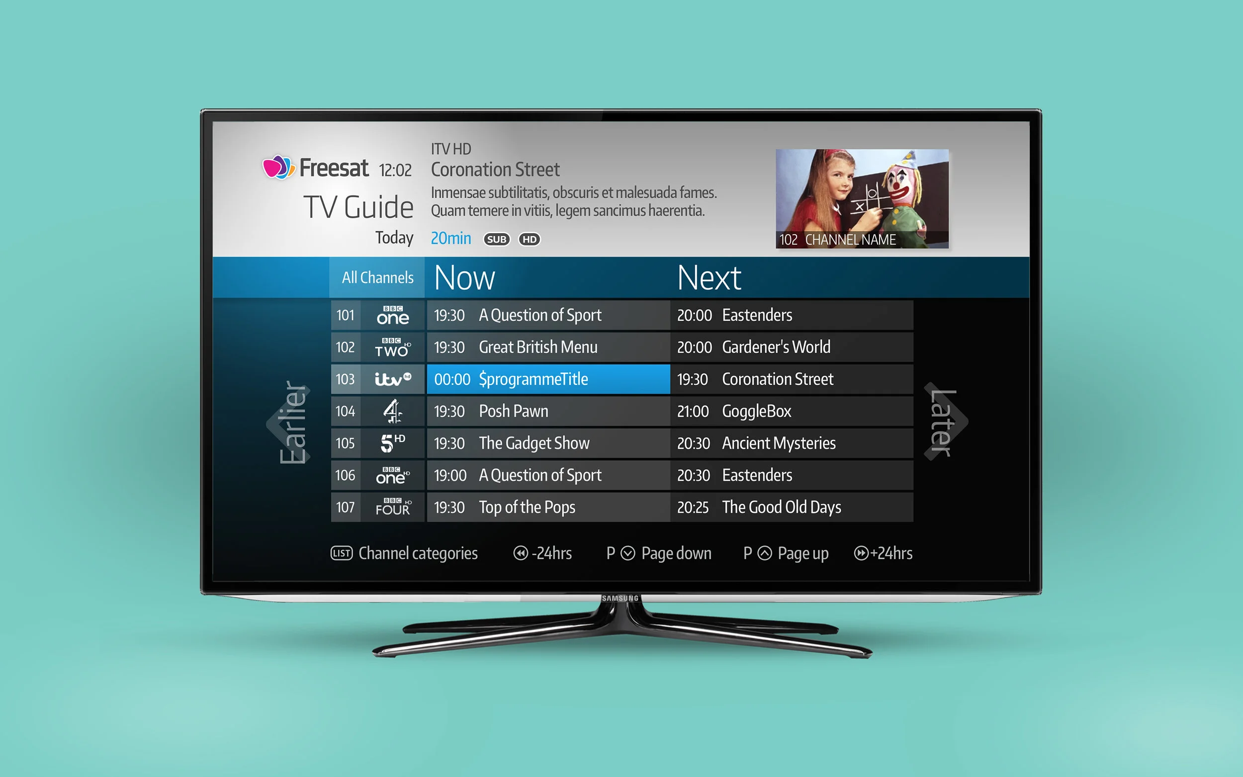
Before--------After
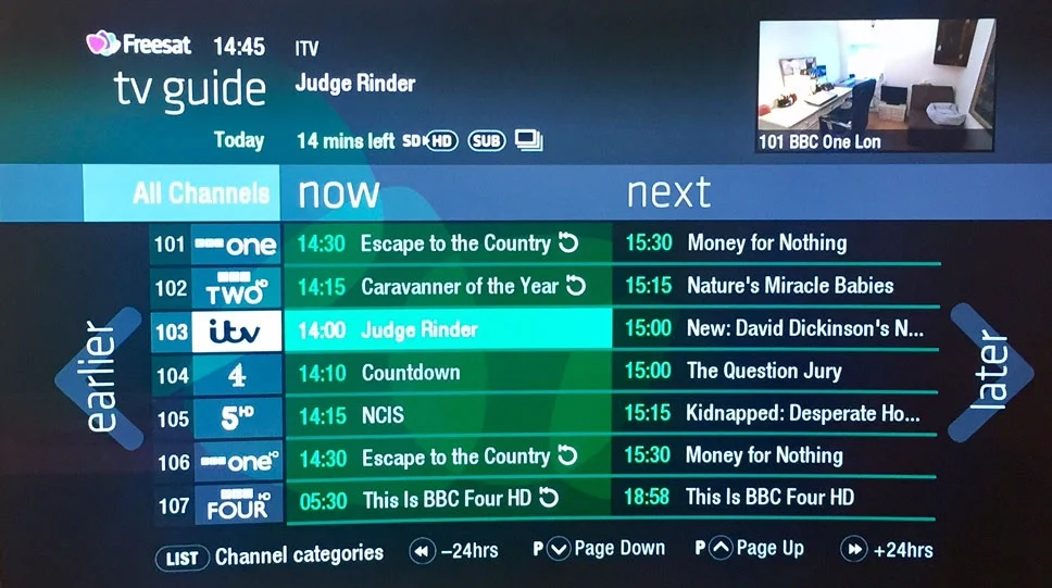
Results

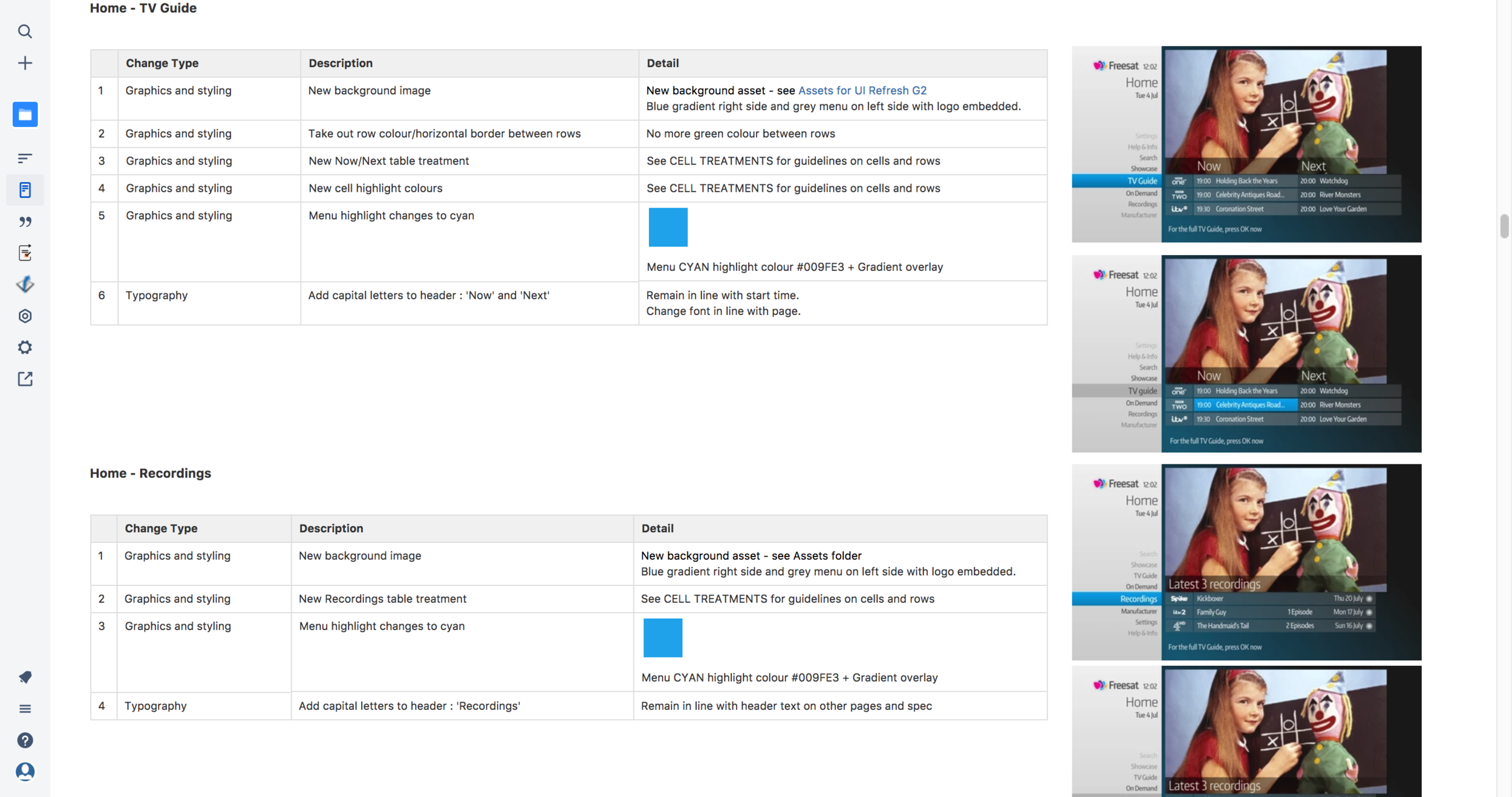
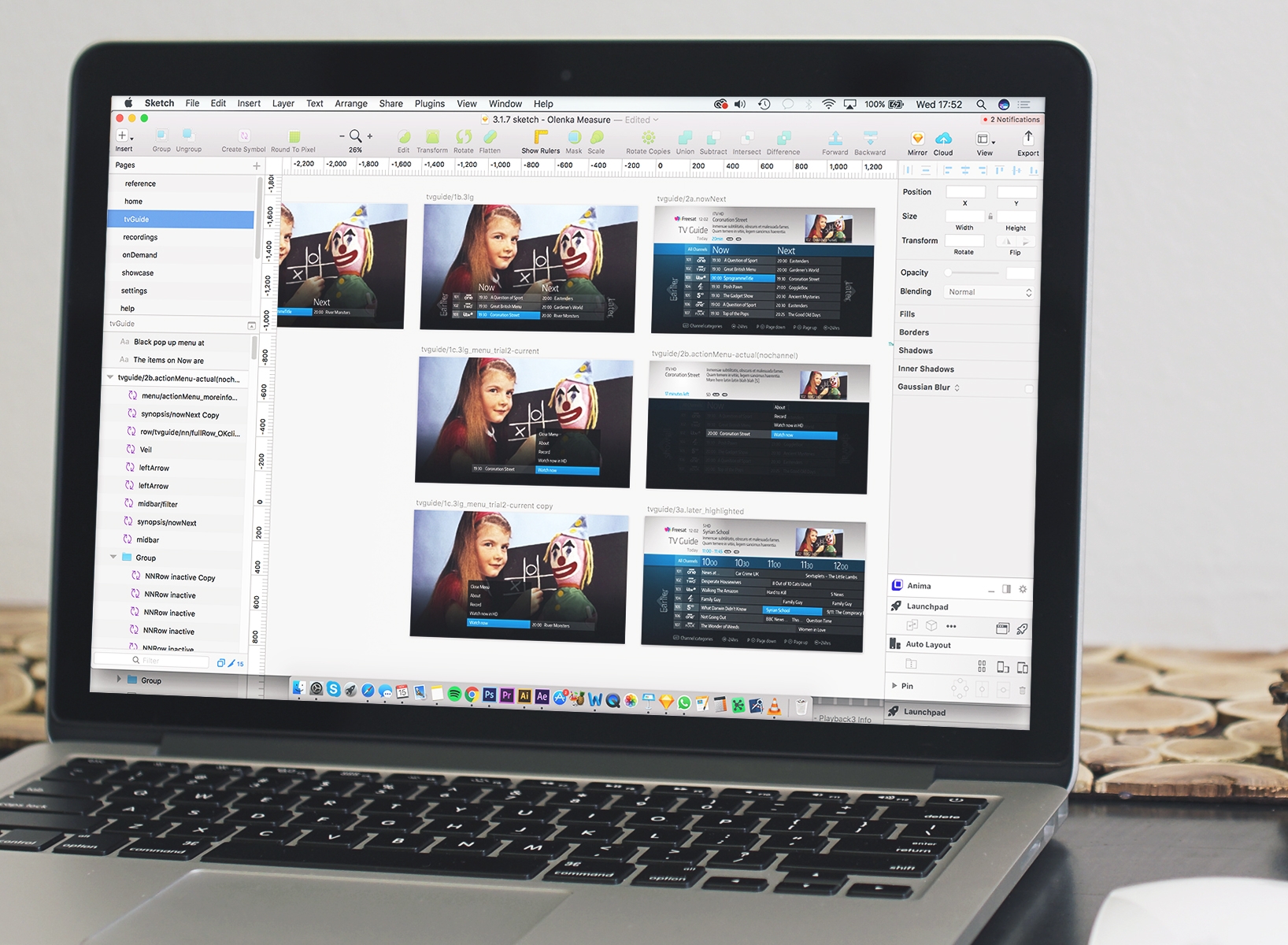
Documentation
The documentation needed to be accurate enough that contractors could understand and work quickly. As well as a full Sketch Measure document being created, I also made a confluence page with all the necessary detail and assets included for each screen. As there were no UX changes it was a matter of colours, details and asset replacements.